ShopDreamUp AI ArtDreamUp
Deviation Actions


Suggested Deviants


![Wolven cleric of the grave [patreon]](https://images-wixmp-ed30a86b8c4ca887773594c2.wixmp.com/f/b3ef4d5f-3bac-4ee3-9de2-0689c965a7b7/ddb6dd5-cb8d0398-ed53-4843-b55c-e686bd6073aa.jpg/v1/crop/w_184,h_184,x_19,y_0,scl_0.25879043600563,q_70,strp/wolven_cleric_of_the_grave__patreon__by_themefinland_ddb6dd5-92s-2x.jpg?token=eyJ0eXAiOiJKV1QiLCJhbGciOiJIUzI1NiJ9.eyJzdWIiOiJ1cm46YXBwOjdlMGQxODg5ODIyNjQzNzNhNWYwZDQxNWVhMGQyNmUwIiwiaXNzIjoidXJuOmFwcDo3ZTBkMTg4OTgyMjY0MzczYTVmMGQ0MTVlYTBkMjZlMCIsIm9iaiI6W1t7ImhlaWdodCI6Ijw9NzExIiwicGF0aCI6IlwvZlwvYjNlZjRkNWYtM2JhYy00ZWUzLTlkZTItMDY4OWM5NjVhN2I3XC9kZGI2ZGQ1LWNiOGQwMzk4LWVkNTMtNDg0My1iNTVjLWU2ODZiZDYwNzNhYS5qcGciLCJ3aWR0aCI6Ijw9MTAwMCJ9XV0sImF1ZCI6WyJ1cm46c2VydmljZTppbWFnZS5vcGVyYXRpb25zIl19.66McoEaMxqXS6oeEBoDJD3o3YiHMcFjQ97Dpn_HOvCE)
![Wolven cleric of the grave [patreon]](https://images-wixmp-ed30a86b8c4ca887773594c2.wixmp.com/f/b3ef4d5f-3bac-4ee3-9de2-0689c965a7b7/ddb6dd5-cb8d0398-ed53-4843-b55c-e686bd6073aa.jpg/v1/crop/w_92,h_92,x_9,y_0,scl_0.12939521800281,q_70,strp/wolven_cleric_of_the_grave__patreon__by_themefinland_ddb6dd5-92s.jpg?token=eyJ0eXAiOiJKV1QiLCJhbGciOiJIUzI1NiJ9.eyJzdWIiOiJ1cm46YXBwOjdlMGQxODg5ODIyNjQzNzNhNWYwZDQxNWVhMGQyNmUwIiwiaXNzIjoidXJuOmFwcDo3ZTBkMTg4OTgyMjY0MzczYTVmMGQ0MTVlYTBkMjZlMCIsIm9iaiI6W1t7ImhlaWdodCI6Ijw9NzExIiwicGF0aCI6IlwvZlwvYjNlZjRkNWYtM2JhYy00ZWUzLTlkZTItMDY4OWM5NjVhN2I3XC9kZGI2ZGQ1LWNiOGQwMzk4LWVkNTMtNDg0My1iNTVjLWU2ODZiZDYwNzNhYS5qcGciLCJ3aWR0aCI6Ijw9MTAwMCJ9XV0sImF1ZCI6WyJ1cm46c2VydmljZTppbWFnZS5vcGVyYXRpb25zIl19.66McoEaMxqXS6oeEBoDJD3o3YiHMcFjQ97Dpn_HOvCE)


Suggested Collections


You Might Like…


![[Practice] Werewolf [SacredTemplar]](https://images-wixmp-ed30a86b8c4ca887773594c2.wixmp.com/f/385ff647-b3c3-4428-9b1d-ecf7d05f2f7d/dds9uwj-210aaf20-f58b-4cf8-bba5-9d561ff2fad0.jpg/v1/crop/w_184,h_184,x_0,y_0,scl_0.078632478632479,q_70,strp/_practice__werewolf__sacredtemplar__by_evokstudios_dds9uwj-92s-2x.jpg?token=eyJ0eXAiOiJKV1QiLCJhbGciOiJIUzI1NiJ9.eyJzdWIiOiJ1cm46YXBwOjdlMGQxODg5ODIyNjQzNzNhNWYwZDQxNWVhMGQyNmUwIiwiaXNzIjoidXJuOmFwcDo3ZTBkMTg4OTgyMjY0MzczYTVmMGQ0MTVlYTBkMjZlMCIsIm9iaiI6W1t7InBhdGgiOiJcL2ZcLzM4NWZmNjQ3LWIzYzMtNDQyOC05YjFkLWVjZjdkMDVmMmY3ZFwvZGRzOXV3ai0yMTBhYWYyMC1mNThiLTRjZjgtYmJhNS05ZDU2MWZmMmZhZDAuanBnIiwiaGVpZ2h0IjoiPD0xMjgxIiwid2lkdGgiOiI8PTEyODAifV1dLCJhdWQiOlsidXJuOnNlcnZpY2U6aW1hZ2Uud2F0ZXJtYXJrIl0sIndtayI6eyJwYXRoIjoiXC93bVwvMzg1ZmY2NDctYjNjMy00NDI4LTliMWQtZWNmN2QwNWYyZjdkXC9ldm9rc3R1ZGlvcy00LnBuZyIsIm9wYWNpdHkiOjk1LCJwcm9wb3J0aW9ucyI6MC40NSwiZ3Jhdml0eSI6ImNlbnRlciJ9fQ.ZNypyP-GZZ9g2E3Yqk9N4hsJYVXbLv5fIN5GnlGvVhA)
![[Practice] Werewolf [SacredTemplar]](https://images-wixmp-ed30a86b8c4ca887773594c2.wixmp.com/f/385ff647-b3c3-4428-9b1d-ecf7d05f2f7d/dds9uwj-210aaf20-f58b-4cf8-bba5-9d561ff2fad0.jpg/v1/crop/w_92,h_92,x_0,y_0,scl_0.039316239316239,q_70,strp/_practice__werewolf__sacredtemplar__by_evokstudios_dds9uwj-92s.jpg?token=eyJ0eXAiOiJKV1QiLCJhbGciOiJIUzI1NiJ9.eyJzdWIiOiJ1cm46YXBwOjdlMGQxODg5ODIyNjQzNzNhNWYwZDQxNWVhMGQyNmUwIiwiaXNzIjoidXJuOmFwcDo3ZTBkMTg4OTgyMjY0MzczYTVmMGQ0MTVlYTBkMjZlMCIsIm9iaiI6W1t7InBhdGgiOiJcL2ZcLzM4NWZmNjQ3LWIzYzMtNDQyOC05YjFkLWVjZjdkMDVmMmY3ZFwvZGRzOXV3ai0yMTBhYWYyMC1mNThiLTRjZjgtYmJhNS05ZDU2MWZmMmZhZDAuanBnIiwiaGVpZ2h0IjoiPD0xMjgxIiwid2lkdGgiOiI8PTEyODAifV1dLCJhdWQiOlsidXJuOnNlcnZpY2U6aW1hZ2Uud2F0ZXJtYXJrIl0sIndtayI6eyJwYXRoIjoiXC93bVwvMzg1ZmY2NDctYjNjMy00NDI4LTliMWQtZWNmN2QwNWYyZjdkXC9ldm9rc3R1ZGlvcy00LnBuZyIsIm9wYWNpdHkiOjk1LCJwcm9wb3J0aW9ucyI6MC40NSwiZ3Jhdml0eSI6ImNlbnRlciJ9fQ.ZNypyP-GZZ9g2E3Yqk9N4hsJYVXbLv5fIN5GnlGvVhA)


Description
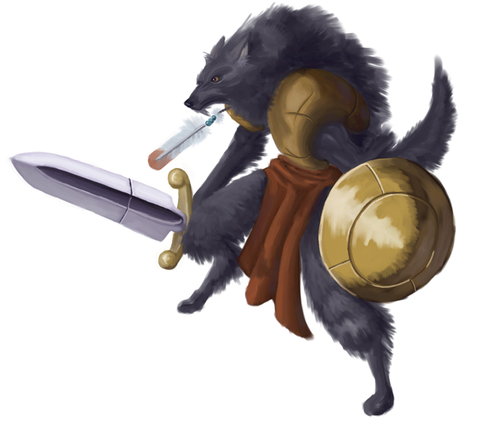
Tools: Painter IX, Intuos 3, Sanford Uni-Ball micro (for the sketch)
Done from a sketch (which you can find in my scrapbook). I'm kinda surprised at how this turned out (considering that the last time I tried painting/coloring something it wound up like THIS: [link]). I think I'm slowly beginning to understand this color nonsense... So I guess I'm learning (All right! Small victory! Yay!)!
Funny thing is that I was about to leave it in sketch form...
Bah. I won't bore you with the details...
Image size
700x596px 142.58 KB
© 2006 - 2024 Dash-X
Comments18
Join the community to add your comment. Already a deviant? Log In
hi i'm making a trading card game and i was wondering if i could use this drawing for a card i will give credit where it is deserved and plus its a easy way to spread your art plus you can still use them for your project the card game is called Paragon Galaxy the concept is a galaxy built where all these worlds exist for the perfect galaxy . The galaxy will grow and grow until this perfection is formed